mindwave coaching & counseling
Designing an MVP
Mindwave coaching & counseling web platform
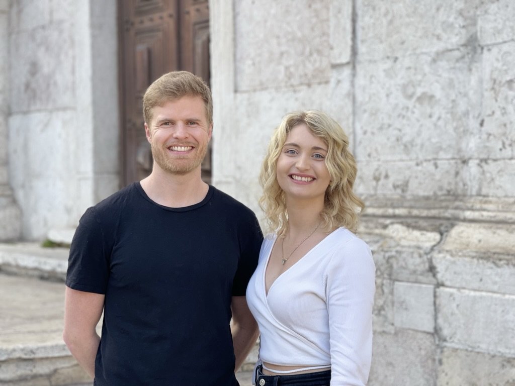
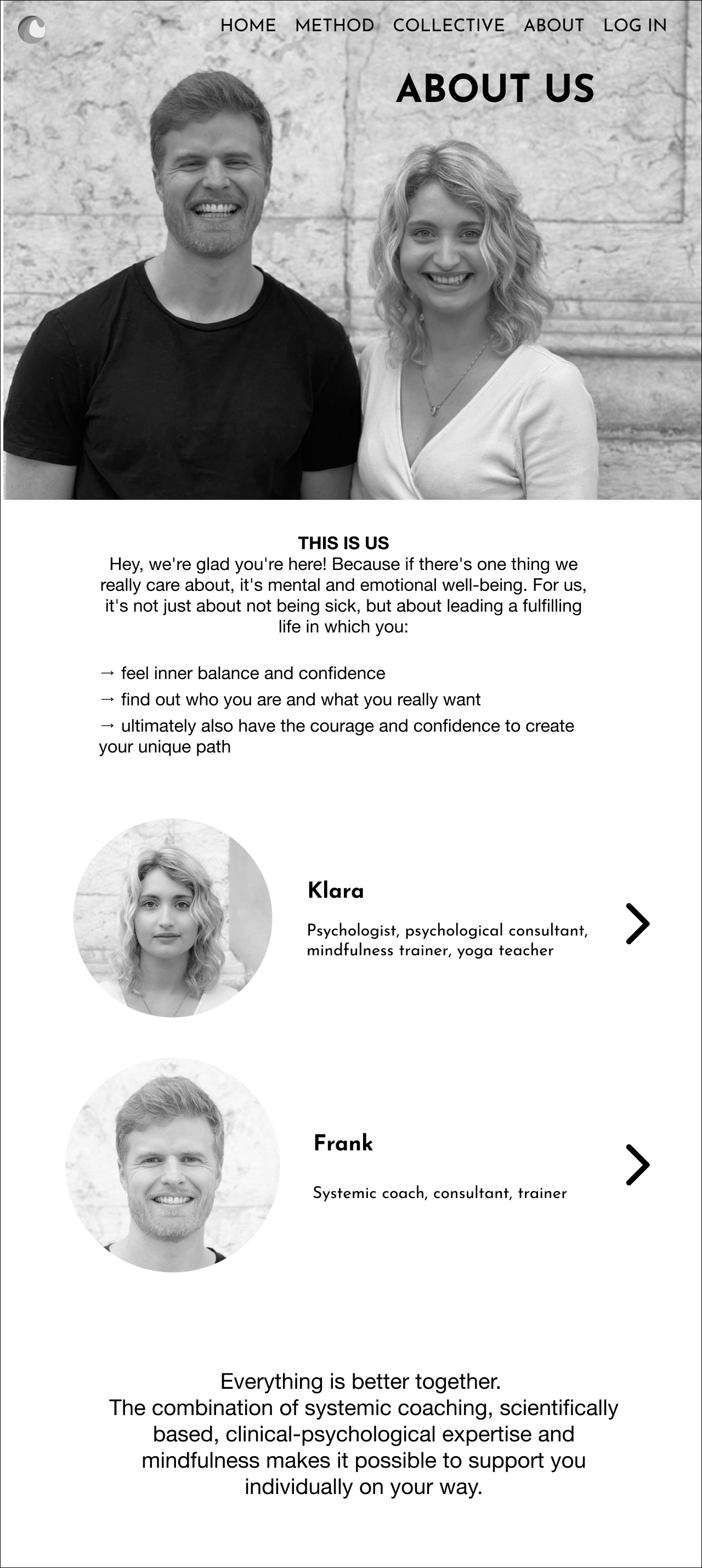
Our final project at IronHack Germany is to work exclusively with a client to create an MVP in two weeks. I chose to work with Mindwave Coaching & Counseling, a German company, comprised of two co-founders, Frank and Klara, whom are certified coaches offering mental and emotional support specifically to teenagers and adolescents. online.
As a new company, they were already looking to have an MVP ready to approach investors with. I designed a web platform for them, including registration for a weekly group coaching course, in order to convert new clients into monthly members.
THE CLIENT’S NEEDS
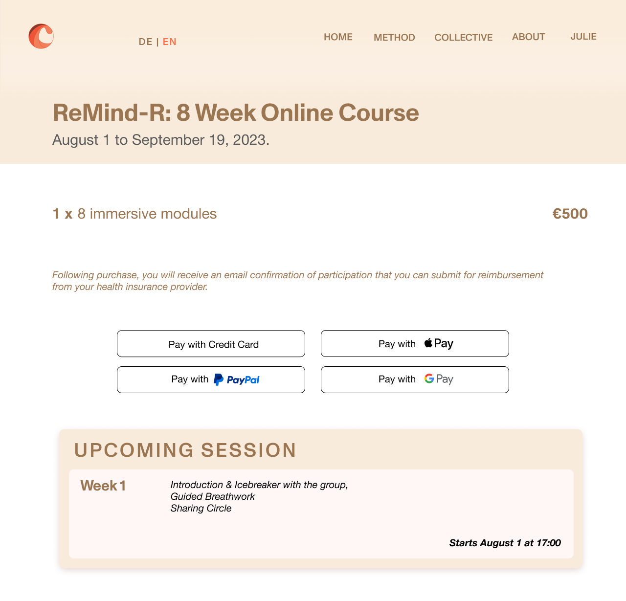
Frank and Klara have an existing website which includes a contact page to book a complimentary initial consultation call with either of them. They are currently offering 1:1 coaching with individual clients, but need a platform to conduct weekly group sessions, called “ReMind-R” to retain their clients and introduce them to mindfulness topics. In addition, this course can be fully reimbursed by public health insurance providers in Germany, so they want to communicate how easily accessible and affordable registering for this course can be. They hope to host this 8-week course every 2 months, so there is a regular occurrence for potential clients who are not able to sign up immediately. Upon completion of the course, they hope to convert participants into monthly members with an affordable membership fee, gaining access to a portal on their web platform that will offer exclusive content and tips to further support their mental health and well-being.
After our initial call and speaking about their design needs and preferences, the next step was to analyze what other remote coaches and practitioners were doing and how we could differentiate from them in the market.
Competitor Analysis
When I first asked my clients which websites they liked for their UI aspects, they mentioned a few platforms that offer yoga, meditation and fitness classes in an online and remote studio setting. Some of these included Open Studio and Remedy Studio, offering on-demand classes via monthly membership pricing in a boutique setting; also providing a free trial option for new users before registering.
The Open method, open studio
Aesthetically, my clients also preferred high-quality graphics with minimalist font and button styles. Such examples from Open Studio & Remedy Studio use photos of human bodies exercising and meditating in a full-screen layout with a parallax background. While the style of both are quite dark and set on a black background, my clients wanted to convey a bright and warm mood using a lighter color palette.
They also wanted to include an embedded music player on the website with a playlist of curated, popular music, include user testimonials and reviews throughout the site, and an input form to collect an email newsletter list.
SECONDARY RESEARCH
By researching the current industry of coaching, I recognized there is a large spectrum of needs and goals that a patient/user can have addressed. In particular, teenagers may seek coaching and counseling for the following issues:
important decision-making
overcoming challenges at school
improving self-awareness
developing personal strengths
improving personal life and relationships
gain more confidence in themselves
emotional management
Some benefits and outcomes of coaching can include:
better conflict resolution
a positive outlook on life
improved focus and concentration
time management skills
more leisure time
sense of achievement and accomplishment
better stress awareness
understanding different communication styles
In particular, small group coaching can have some advantages over individual coaching, where
less time is required for the coach/facilitator to reach a wider audience
people learn more amongst each other within a short period of time
it provides participants an opportunity to network with each other
In addition, the environment for group coaching must be considered safe and conducive to learning in order for participants to share ideas. The coach/facilitator should also create a concise checklist of goals and expectations to give a sense of purpose and responsibility, making the participants engaged and excited for each session.
Wordcloud of '“mental well-being” keywords
USER RESEARCH
I conducted a user survey on the topic of “mental well-being,” which was sent to teenagers and young adults via Discord forums, word of mouth, and through social media platforms such as Linkedin and Instagram. Some insights that I gathered were
70% of users choose a therapist/wellness professional by recommendation
61.5% of users believe affordable cost is important
71% of users prefer exercise and movement to cope with stress and anxiety
When asked what “mental well-being” means to them, users reponded quite positively and prioritized taking care of their own mental health. On the left, you can read some of the keywords that came up for them.
INTERVIEWS WITH SUBJECT MATTER EXPERTS
I was fortunate to speak virtually with three individuals with backgrounds in holistic life coaching, meditation, and yoga teacher training on the topic of coaching and group therapy. Based on their experience, they suggested
hosting group therapy/coaching sessions several times a year to build rapport
offering a class to a pre-established group (from school or a community organization) can be easier than running a program for teenagers that don’t know each other
word of mouth referrals, especially among parents is helpful in building and retaining a new clientele of teenagers
USER PERSONA
user persona, juliette
I created the user persona, Juliette to further empathize with the client’s needs. She is an 18 year old student, graduating from her last year in highschool and will be looking to apply to universities in the next few months. She is open to finding new methods to self-soothe and manage her stress as she enters this transitional life stage. She works a part-time job in retail currently and does not receive a lot of financial assistance from her parents.
USER JOURNEY
User Journey of juliette
Here, you can see her user journey, as she enters her last year of high school. She starts to struggle with her grades at the beginning of the year, which is where we see her start to struggle emotionally. As she is approached with the task of applying for university, she hits an all-time low of stress and also starts to feel disconnected from her friends. Her one friend recommends doing an online mindfulness course together in the Spring, and she complies, becoming more optimistic and excited. After attending a few sessions, she feels more calm and in control of her upcoming year at university.
PROBLEM STATEMENT
“Teenagers need a way to manage their stress levels and regulate their mental well-being as they navigate through a crucial and transitional life stage.”
“HOW MIGHT WE” STATEMENT
“How Might We provide a trusting community for teenagers to learn self-soothing techniques and receive emotional support so they can feel empowered, confident, and resilient to life’s challenges.”
ideation
Using the design sprint of crazy 8’s and bad ideas, I formulated a few ideas of how this user flow would be designed. For the process of booking this 8-week course, I created a site map where the user would land on the homepage first and find a navigation bar with “Method,” a section for all service offerings, including 1:1 coaching, retreats, and on-demand courses, “Collective,” a section to access an exclusive membership portal, “About,” a section with information about the facilitators/coaches, a “Contact Page” with an email input form, and “Profile,” for the user to log in and view their personal preferences. I have included features that were mentioned during the process of secondary research, such as incorporating a music player and Spotify social icon, and how testimonials will be displayed throughout the website.
MID-FI PROTOTYPE
Scroll through the carousel to view the mid-fi wireframe prototype.
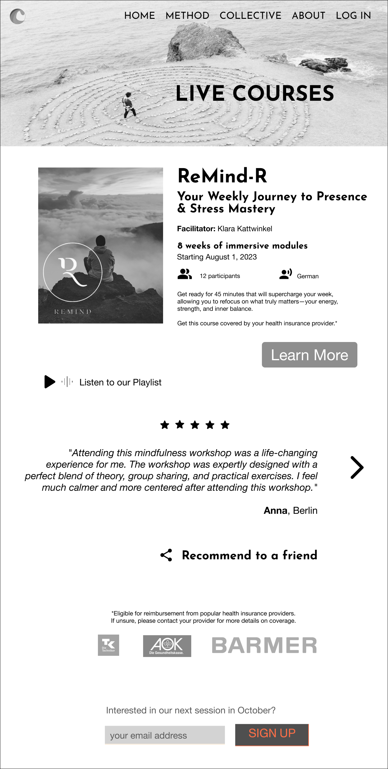
The user starts at the homepage and clicks on “Method” in the navigation bar and chooses the Live Courses page. From there, all courses will be displayed, where a summary of the “ReMind-R” Group Coaching course will be previewed.
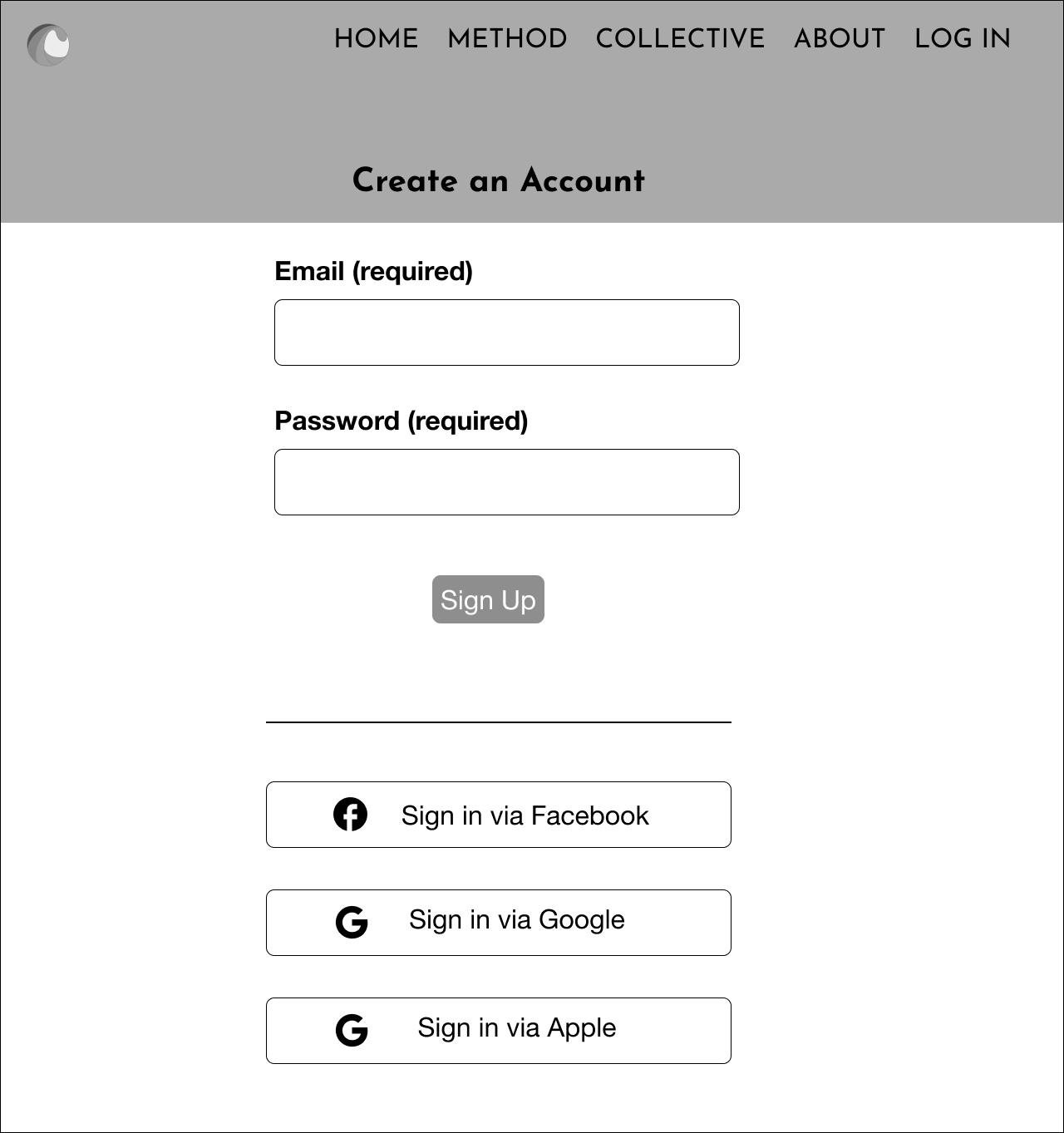
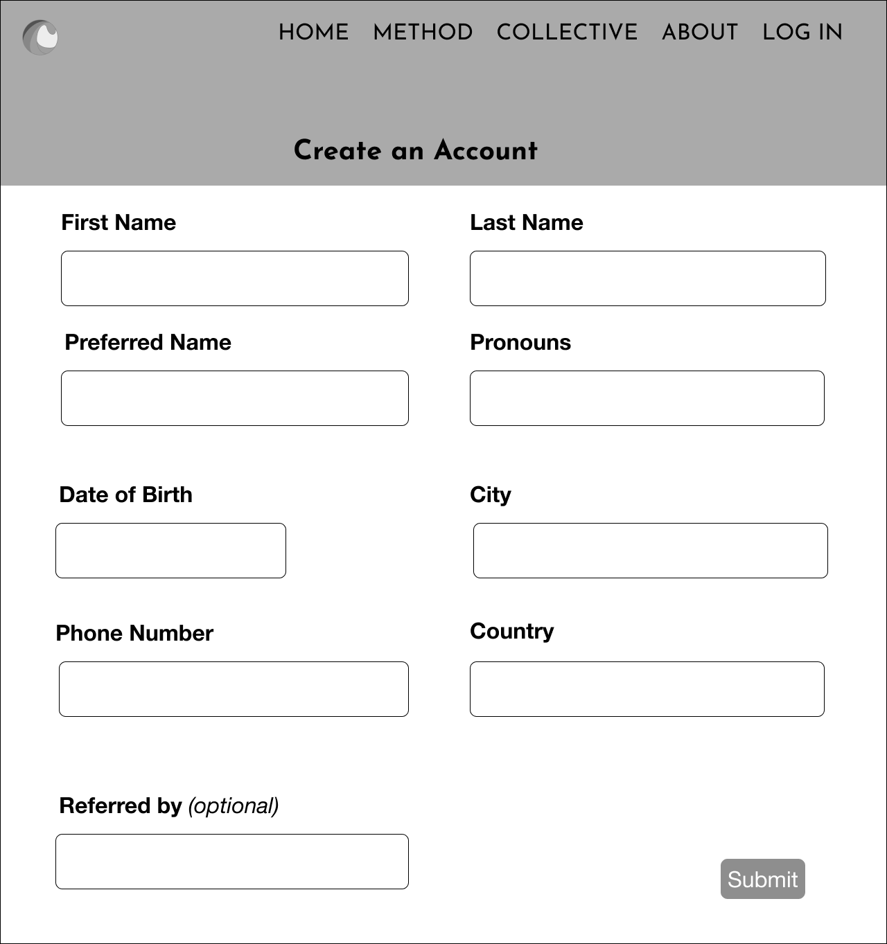
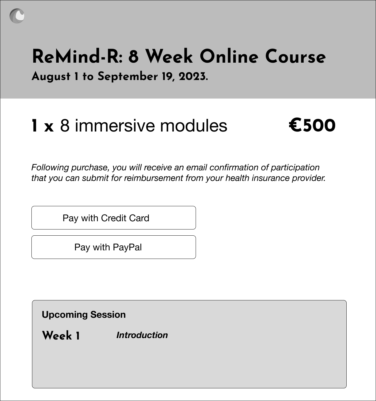
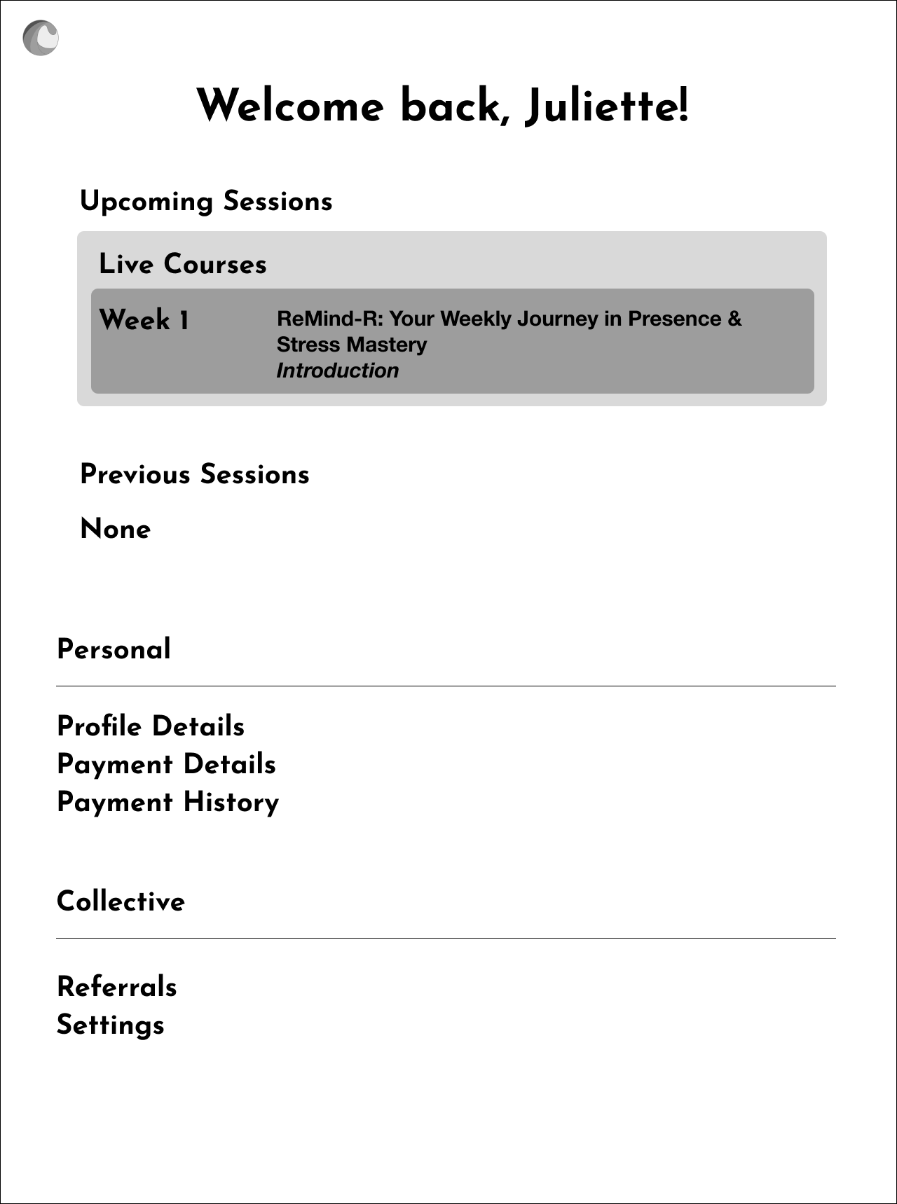
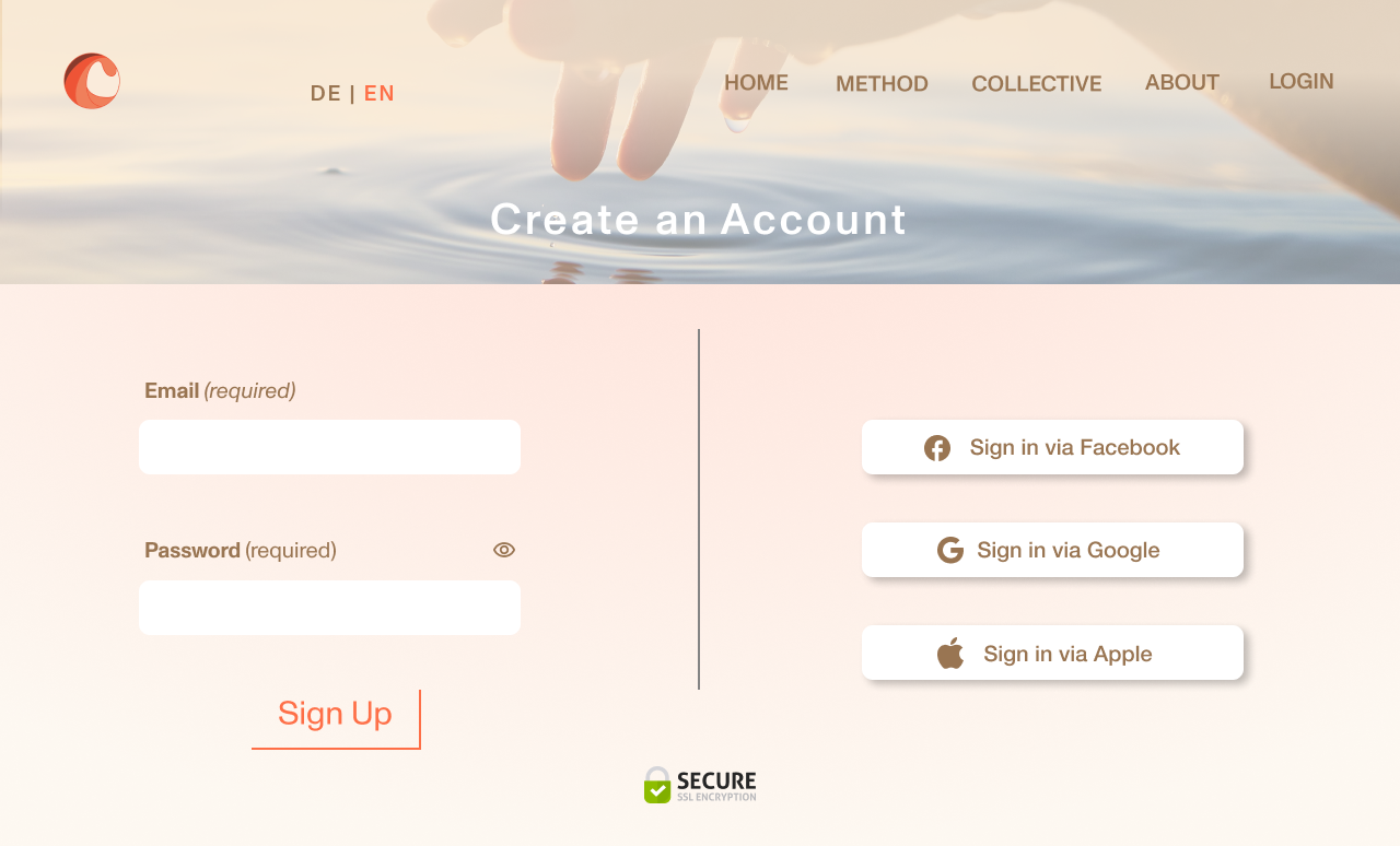
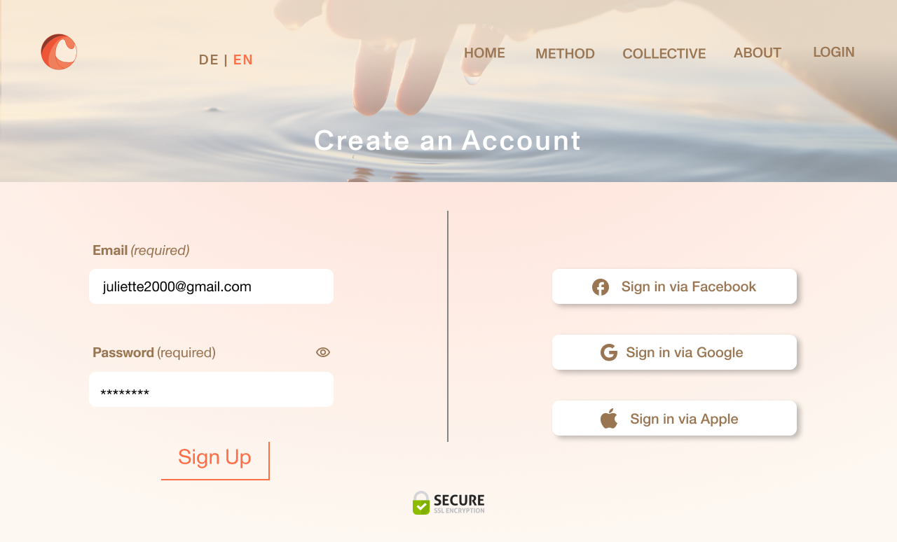
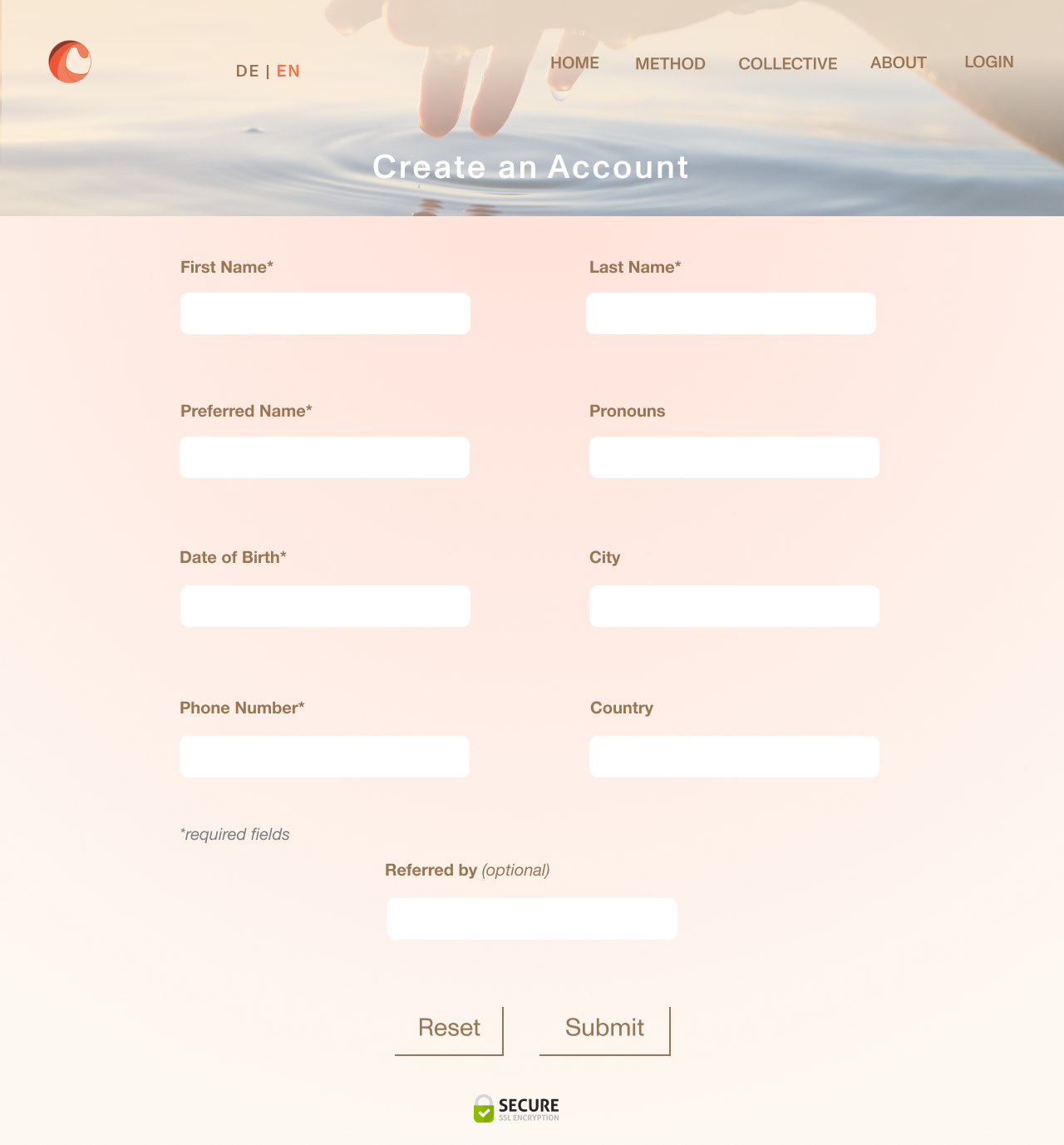
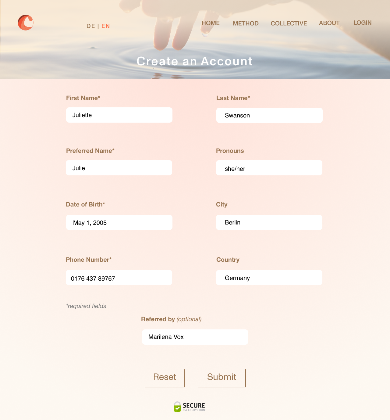
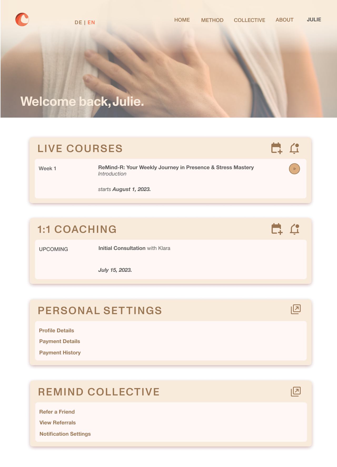
The user will click the ‘Learn More’ button to land on the specific “Remind-R” Course page, where more details about the course including benefits, testimonials, and frequently asked questions are mentioned. Upon clicking the “Register” button, the user has to create an account, and then proceeds to the purchase confirmation page. After purchasing, the user will land on their profile page, with access links to all upcoming group coaching sessions.
Testing & Feedback
Initially, the font face that I used for the Headings, "Josefin Sans,” was commented on by my clients as being too “animated” and “bubbly.” I further decided on a font face that was more minimalist, “Monument Grotesk,” which you can see in the hi-fi prototype. I also changed the sizing of the body text to 16px as it was commonly viewed as being too large.
Users also commented that the sections of each page felt too squished together and that I should increase the amount of negative space in the margins to add more balance and harmony in the overall design.
On the Remind-R Course page, I received a suggestion to include page breaks with the links of the subsections of the page (i.e. Frequently Asked Questions), so the user can jump to particular sections of the page instead of scrolling vertically all the way to the bottom to find specific content.
STYLE TILE
STYLE TILE FOR mindwave coaching & counseling
As mentioned, my clients wanted a minimalist sans serif font, so I chose Monument Grotesk in all capitalized letters with slight letter spacing for the Heading, and Helvetica Neue Regular as the body font face.
The color palette was chosen quite easily, as my clients liked the apricot hue in combination with beige tones. I added white for highlights and a darker brown hue for a contrasting text color.
We ideally wanted the website to look playful, positive, optimistic, hopeful and create a sense of community for its viewers.
HI-FI PROTOTYPE
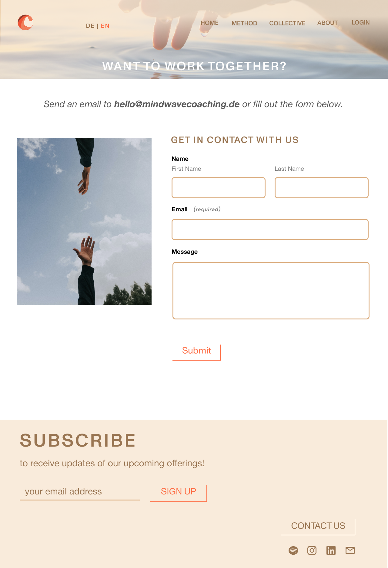
In the hi-fi prototype, I also created a sticky top-navigational menu with a slight background overlay to create contrast when the user scrolls down the page vertically.
I also added the option to change languages on the website from German to English in the navigational menu, as my clients would like to target both German and English-speaking users.
As royalty-free images were chosen for the purpose of this MVP, over time, the clients wish to use their own professional photos taken of themselves and their clients to replace the graphic banners you see here.

Key Learnings & Next Steps
After presenting the user research and MVP to my clients, they were pleased with the outcome of the project. Some key takeways for them were addressing how they would target and attract their main clientele and the competition in the market as there are many coaching programs offering similar services.
As next steps, brand awareness should be made a priority through means of social media engagement and gathering email subscribers. Upon completion of the first cohort of the group coaching sessions in September 2023, the aim is to convert these participants into monthly members to join the “Collective'“. New content will be recorded and be provided on-demand in this members-only portal. Less frequent events such as retreats will also be promoted months in advance of their start date to regular members.
There will also be a calendar integration on the “Contact Us” page for new users to book a 1:1 call with ease and accessibility with one of the coaches. The aim of the “Collective” is to grow the roster of facilitators and experts outside of the two coaches who will host seasonal workshops and classes on various topics in the future.


